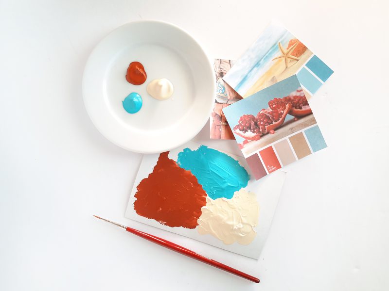
Do you know that feeling, when you come to an art shop and stand in front of endless color collection? It reminds me of my primary school, when new year started and I got a big box of brand new color pencils in many different shades, too perfect to even use them. 🙂 For my art I now use mostly acrylic colors and every now and then I go to the shop and randomly pick few new shades. Just going with the flow and take something that inspires me at that particular moment. I can’t imagine better way to start a new year than with some new colors, agree? I bought three shades, that seem more like summertime, but I guess I needed a fine dose of warmth in this cold season.
My pick was:
- Red Ochre
- Turquoise
- Naples Yellow Deep

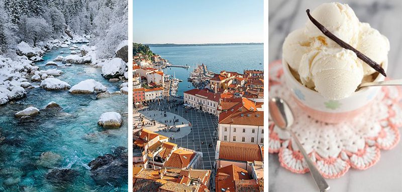
Red Ochre reminds me of many Slovenian towns, where typical landscape feature is red brick roof. Turquoise is one of my favorite colors, reminds me of crystal clear water and nature, I use it a lot for my paintings. The last one is Naples Yellow Deep, beautiful pastel shade that seems like a delicious vanilla icecream. Ok, I have a craving for icecream now 😀

Sometimes picking up some color combinations can be challenging, there are many useful tools, that might help us to find the right palette or just to get inspired a bit. I am a total fan of Design Seeds, a webpage where you can find many different palettes that derive from beautiful photos. In the search menu, you can browse by color pick, season or collection. One clever tool, especially for designers, is also a Color Wheel by Adobe. You can choose various color relations (monochromatic, analog, triad…) and arrange them in individual color groups.

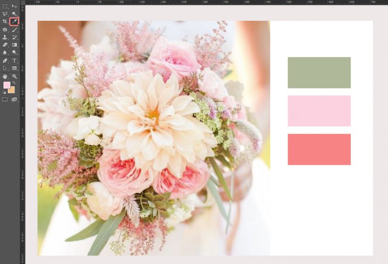
I love to browse through Pinterest or any other inspiration website and I am like a little hamster collecting likeable photos, interiors, flowers, fashion. You can use those photos to get a perfect color scheme. One way is that you try to mix those shades and paint it in your sketchbook, the other option is that you open a picture in Photoshop or similar program and use eyedropper tool.

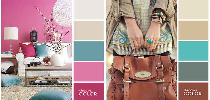
Great resource for color palettes can also be home decor or fashion magazines, stores with textile, art pieces, jewlery and wall painting companies that usually have already prepared color charts.
Do you have any special technique to find perfect color combinations? Or maybe one favorite piece, photo or art that is limitless source for your own work? Would love to hear, what works for you, you can leave a comment below. Looking forward to meet and chat with you!
Don’t forget to follow my Instagram and check, what I’ve been making with color scheme presented above 😉 Have a wonderful & creative start of 2017!
You might also like this:
Leave a Reply